DESIGNING & PROTOTYPING THE INTERFACE
1.4
Exploring the Other
1.1.1
Exploring the Context
1.2.1
Exploring Interfaces
1.3.1
Design Process
1.4.1
Publication Station
UI/UX & Prototyping
1.5.1
Interaction Station
Interface & Machine Learning
1.5.2
STARTPAGE
12.05.2022
Typography & Hierarchy (Kimmy's class)
Notes:
connotational meanings in typography
street type could be just as valuable as design
typefaces are groups of fonts
ex. helvetica
font is if that typeface is: thin, extralight, medium, bold, etc. (changes within the typeface)
find balance between the practicality and the identity
monospace for numbers helps while for text makes it UNREADABLE (does not work)
Hierarchy: Why? What is more important?
- where to start reading
- differentiate between information
- navigating: lead reader through work
- direction of reading/looking
- what is more important...
- rhythm
Paragraph "rules":
- 12 words per line or 40-50 characters per line
- justify (block of text that often creates rivers) or flush (not focused on the shape of the text but the alignment: left, center, right)
kerning: INDIVIDUAL spacing
tracking: GENERAL spacing
leading: line spacing (1.2 books, 1.5 web (more room for light))
old style for reading text
proportional for graphs (numbers)
Books/website for reference:
- conditional design workbook
guiding the reader, rule based design, exercise book
- mcguffin
design magazine
- cookbook of invisible writing
breaks alot of the rules previously said => fuck the rules
- untold-stories
4 columns each scrolable, plays with different sizes, play in steps of 2 (twice as big/small), finding balance in contrast
- ingo offermans
one typeface all the same size, very SPECIFIC, rigid
- velvetyne
bnw with hints of color, combination of typefaces (type foundry)
- grilli type maw
swiss/japan mix of type
- fontsmith
educative on type
- butterick's practical typography
online book
- typeroom
magazine style
tie analogue into design
In class exercise:
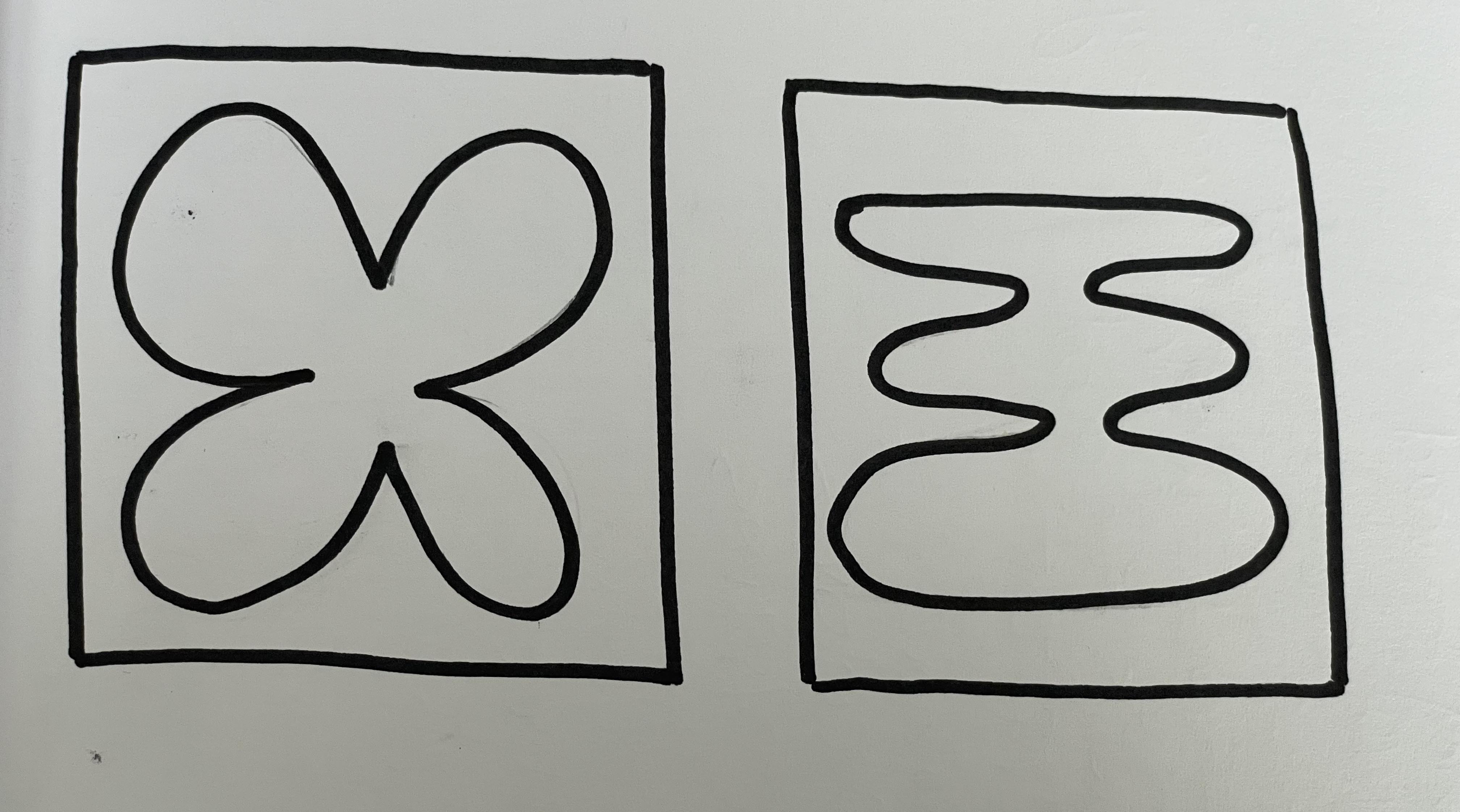
1. pick one sketch and design it in an opposite way
in this exercised i used one of the sketches from our user testing and designed it as a pictogram instead
2. pick another sketch and apply a font of another classmate and apply to your design
in this exercise i selected a sketch from a classmate which was originally a solid object and designed it only with outline as a pictogram again
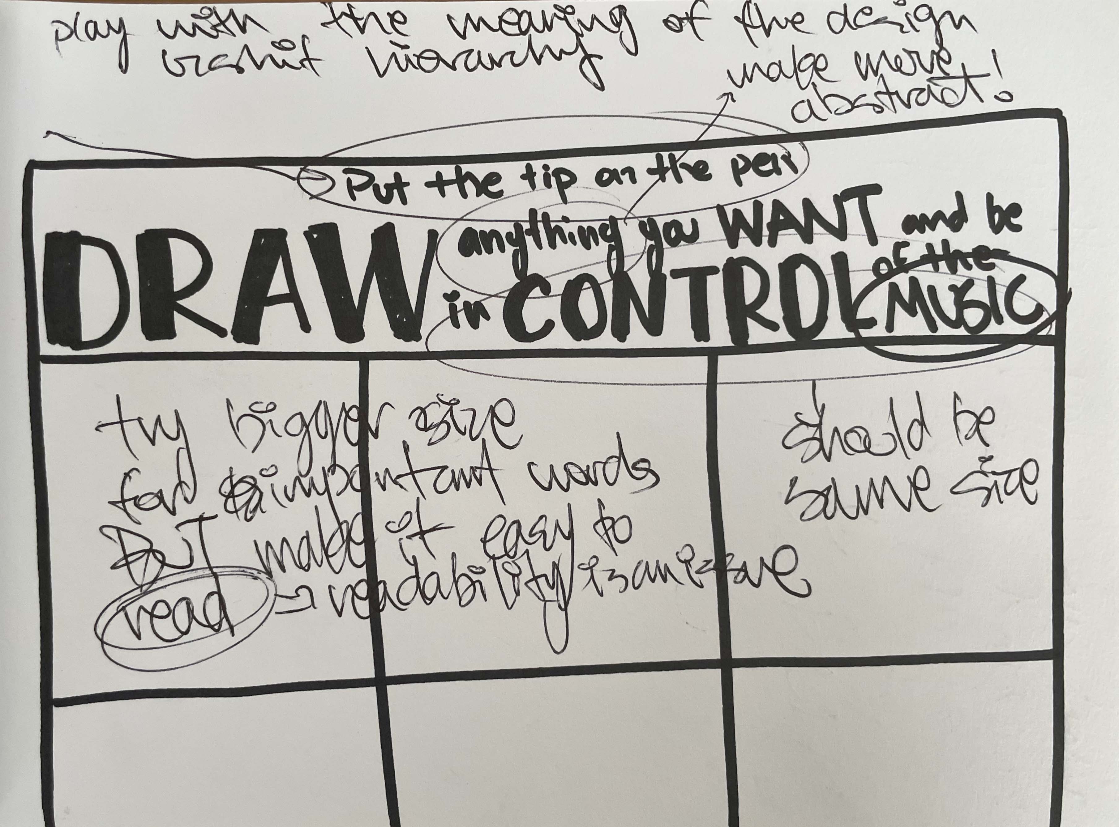
3. take one sketch and redesign the hierarchy of the information in your design
in this exercise i took the typography used in our interface as an instruction and redesigned the hierarchy, and in the end took notes to reflect on the design choice
Insights for 3. :
- confusing to read
- big difference causes confusion
- lack of focus on basic instruction that is key (put the tip on the pen)
- big words give good description
- can incorporate more colors, more squares
use children's book for reference
play with kerning etc.
what can i play with?
don't limit myself by applying one typeface
PLAY by using this exercise
Interface prototyping and designing within group
Decisions:
- BnW: either high energy or low energy (or no) (scrapping of MID ENERGY)
- 10 high, 10 low, 5 no energy 30 second music samples from ninja tunes
- have similar BPM in category (maybe if helpful)
Step by step of user interaction:
1. user gets pen
2. read instructions
3. starts drawing
4. after 20 seconds of drawing music starts playing
5. user keeps on drawing
6. different music starts playing (after 20 seconds)
.
.
.
last step: fade out music when stop
Tempo:
increase or decrease by ex. 50 BPM (smaller is easier to work with) depending on if the reading is high (+50) or low (-50) energy, no energy=0
how to match tracks?
- cut on beat
- be aware of BPM
Overview of interface:
- An interface that records 20 seconds of data from the user, classifies the data, returns music as output, REPEAT until end
- "seamless" track change
- tempo change (high (+), low (-), no (0))
- kill switch (no energy, no energy = kill switch)
User testing talk with Noemi:
Abstract instructions (How?)
make group and test together
be aware of the TIME, SPACE & WEATHER when planning a test
speakers + place to sit/interact
be considerate of what each duo does (school scenario => rooms, playground => different areas)
make use of the rental service at uni
Instructions for interface:
ask kids what it would take for them to draw abstract and raw art => freely draw, NOT things
(lines, scribbles circles, random shapes,...)
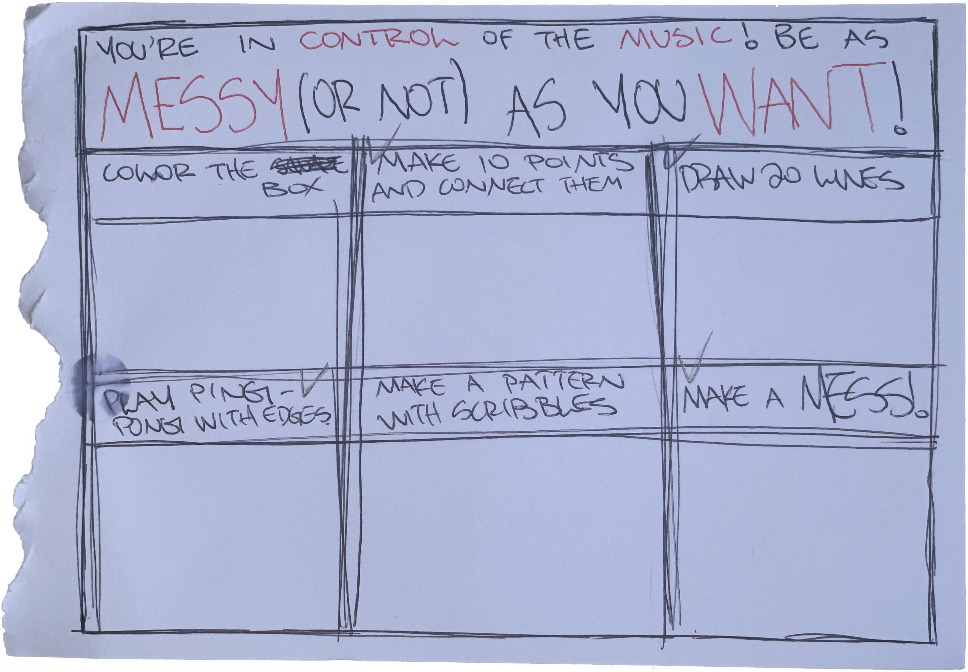
example: fill in square as fast as you want
DIFFERENT TASKS:
1. each square has a task
2. multiple cards with each a task
General instruction for kid:
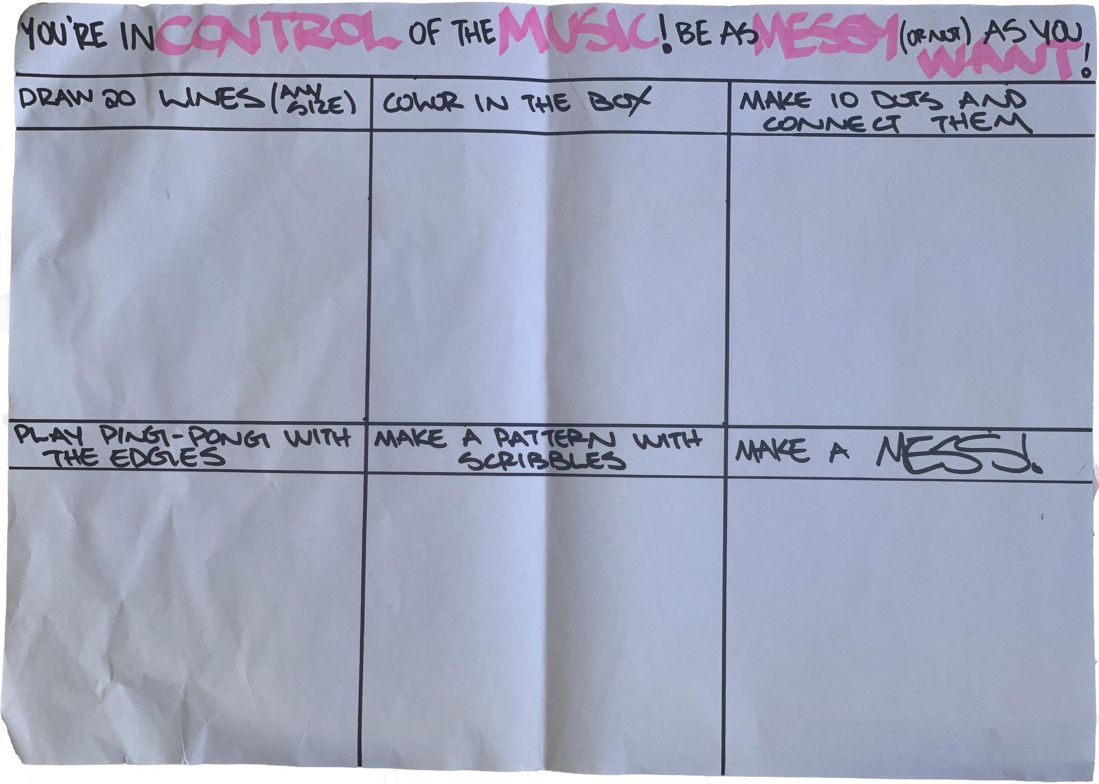
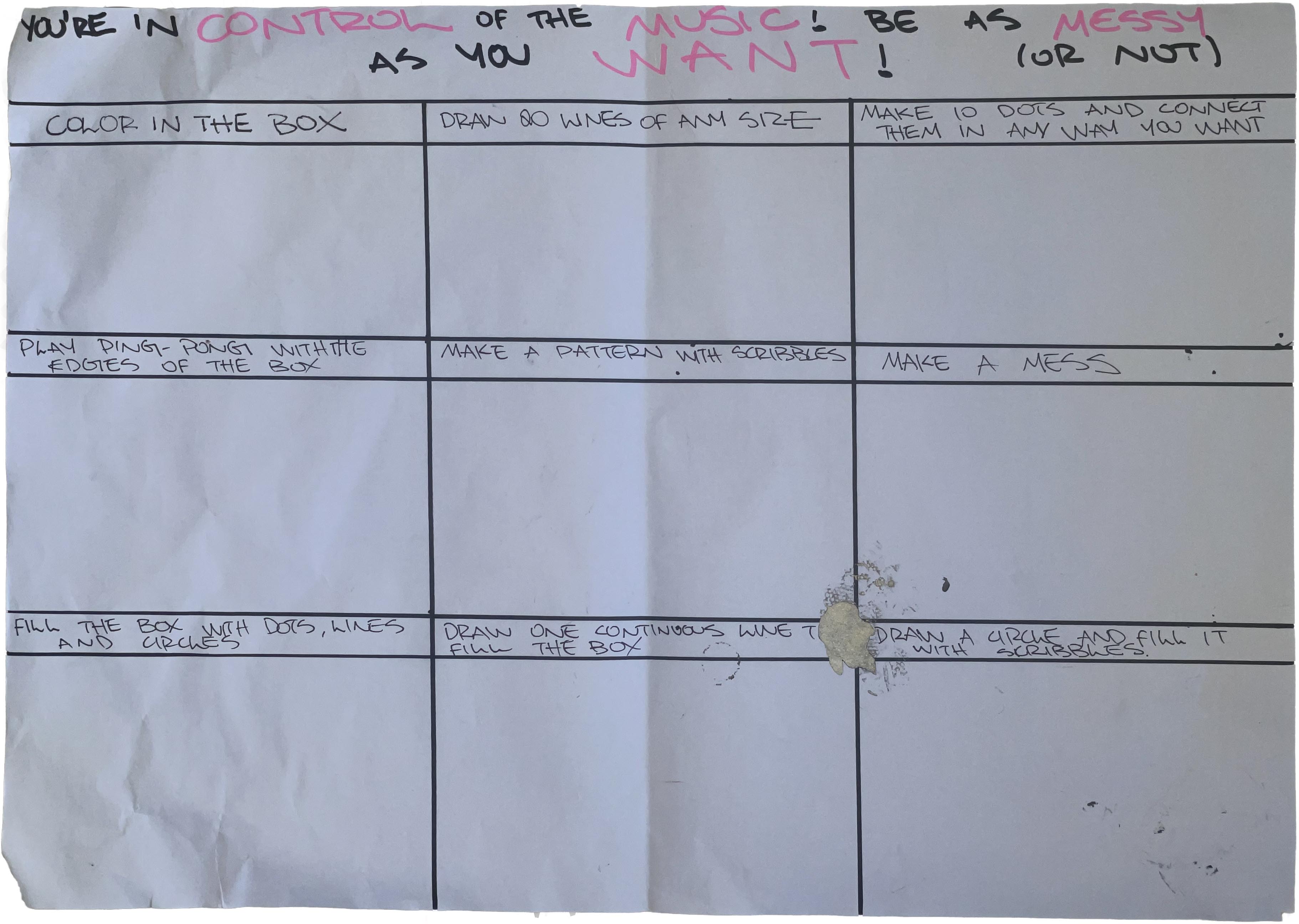
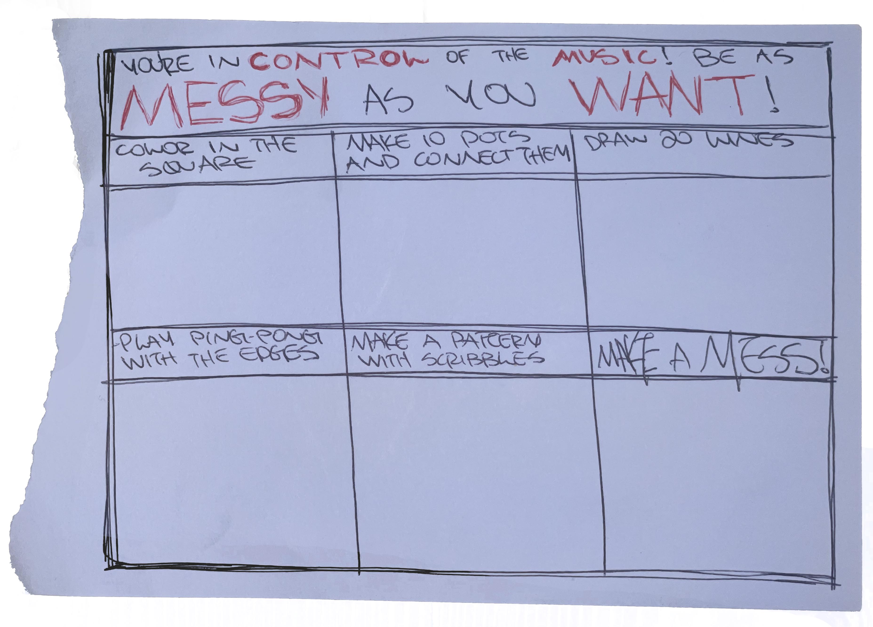
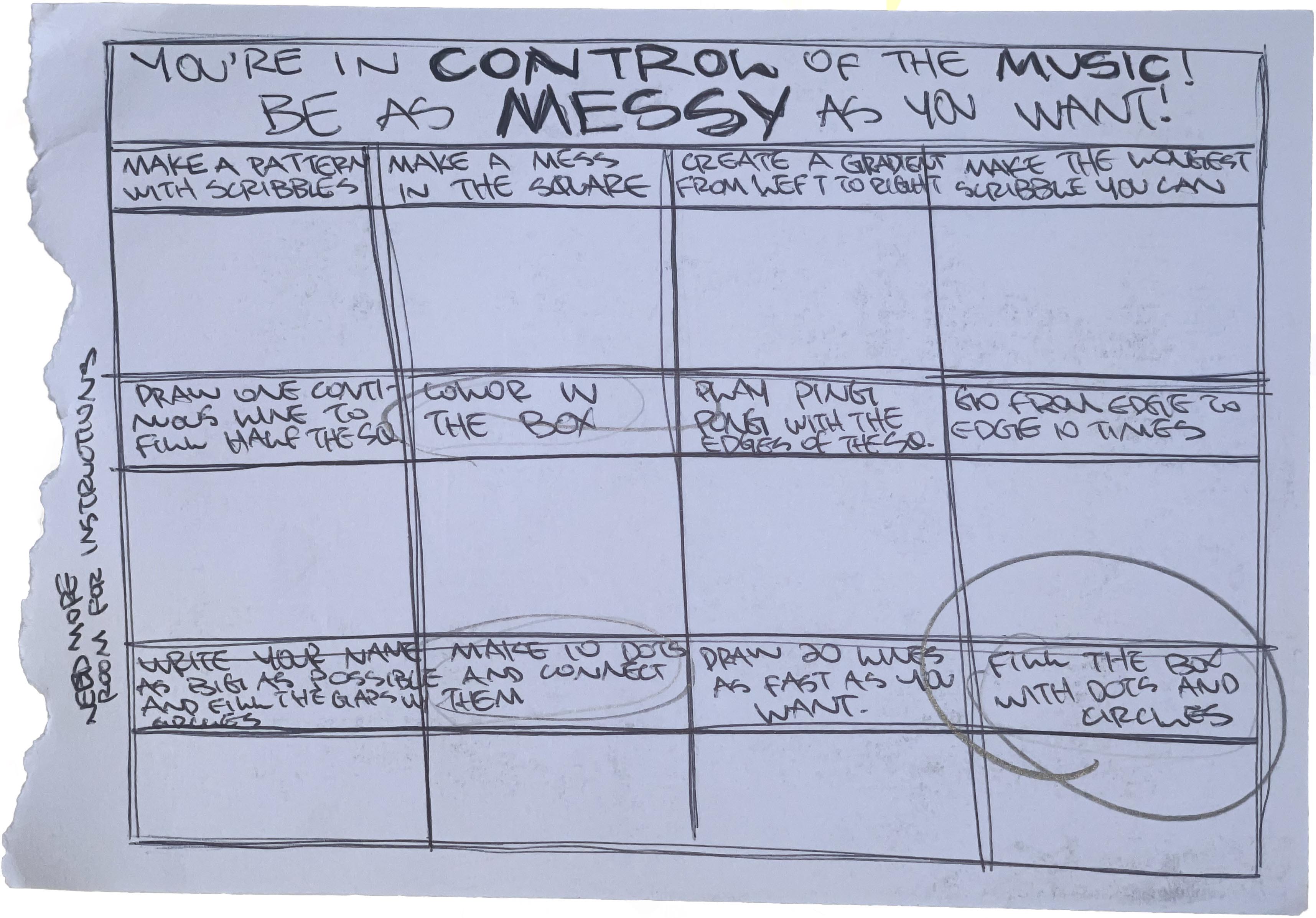
YOU'RE IN CONTROL OF THE MUSIC!
Different tasks:
- draw 100 lines as fast as you want
- fill the box with circles
- color in the box
- play ping-pong with the edges of the box
- make 10 dots and connect them
- make the longest scribble you can
- draw one continuous line to cover half of the square
- make a pattern with scribbles
- draw 4 squares and fill them each in any way you want
- create a gradient from left to right
- make a mess in the square
- write your name to fill the whole square and fill in the gaps with circles
additional instruction: BE AS MESSY (OR NOT) AS YOU WANT!
use analog photocopy aesthetics for typography
EXERCISE SHEET PROTOTYPES
(LO-FI PAPER PROTOTYPES)
DATA RECORDING FOR OPTIMIZATION OF MACHINE LEARNING CLASSIFICATION SYSTEM
Hi-fi prototype development:
after deciding on the format we want for the exercise sheet, we made an additional decision to follow through with analog aesthetics and develop a digital printable version, with the goal of the interface including a website from which "exercise sheets" can be downloaded and printed.
SCANS USED TO CREATE HI-FI PROTOTYPES
HI-FI PROTOTYPES
THROUGH USER TESTING THESE 2 PROTOTYPES WERE SELECTED AS THE BEST. THE REASONS BEING THAT THEY ARE COLORFUL AND INCLUDE STIMULATING ELEMENTS SUCH AS LINES AND DOTS
BEST HI-FI PROTOTYPES
FINAL EXERCISE SHEETS
through the feedback we received in the user testing we optimized the best hi-fi prototypes and created these versions
Hi-fi prototype development of musical pen:
after sketching out an initial idea for the form in which the pen will be and discussing different ideas, we decided to create a 3d printed "pen" to house all the technical equipment necessary for its function (power bank as energy source, wires, arduino board, pen/crayon/marker)
3D MODEL OF "PEN"
SKETCHES OF INTERFACE DESIGN ("PEN")
In addition to the exercise sheets and the "pen", we also created some graphics to include ON the pen itself, after receiving feedback through the user testing that we should include more colors
SCANS USED